Showing posts with label FMP. Show all posts

Making Porcelain Tea Cups

The cast of a teacup that I've recently made from plaster of Paris has completely dried up. To make the cups from the mould you need to have the slip and stir it well until it's of equal consistency. Have a jug, a bucket and wooden planks called guides near by. Place the guides on top of the bucket with a space where the mould hole is. Dip the jug into the slip, with a good amount and pour into the mould without spilling over. After this wait approximately four to five minutes, the size of mould and how much water is in the slip will estimate how much time to wait. When all that's done the next stage is turn the mould upside down and over the bucket with the guides supporting it. Leave like this for over 10 minutes to drain the excess slip then turn it back over and wait for the slip in the mould to dry more. Lastly is just taking the cup out and neatening it with a grater and sea sponge and the piece is complete. 


posted under , , | 0 Comments

Johnson Tsang

Johnson Tsang is a ceramic artist than doesn't let the material matter so much for his creations. Many artists would assume clay could only create rigid forms and shapes as most often pottery is constrained to just that. Tsang manages to make splash effects and detailed petals of roses that is probably quite fragile to the touch with its thinness, especially during its drying stages. Movement can be seen very often with his work as he doesn't let simple limitations stop him from making free and flowing pieces. Another thing that's focused upon is faces, human faces seem very prominent in many of his clay works, some unsettling when it's those marketed toy dolls that now have realistic baby faces on ball-jointed torsos. 
As an artist he does focus on the some of the Chinese culture with his his sculptures, he has made a few dragons that could be seen bursting out of the pottery or tightly coiling around pieces as they're strong viscous creatures. I intend on placing a dragon on my own teapot as I find they're significant to the culture. My choice in tea cup shape was also because of Johnson Tsang as its petite with no handle that can be held in the palm of your hand like a flower bud. This tea cup is frequently shown in his works, mostly with the series of water movement. 


Coil Built Teapot

The teapot is always considered to be the main part of any tea set, sometimes its similar to the teacups other times it's contrasting in shape but never colour. My teapot was done using the method of coil building and as shown here, it is perhaps more like the Aladdin lamp from Disney than looking like a Chinese teapot. This was my first attempt at ever structuring anything in ceramics especially something like pottery work and perhaps it would've worked best if I used the pottery wheel if I had a better understanding of how to use it, still that would've more taken time and practice than I had available. 
To get the basic of the shape right I needed to keep drying the inside for every coil added as it would sink from the pressure of its shape otherwise. The spout was then added and holes were poked where the spout meets base and they were cross hatched together like the handle was. The handle was done using one of the coil coins and left to dry after I shaped it the way I wanted it go on the teapot. To do the top I added a thin coil to the top where the hole is to make a lip and coil built the lid. The teapot had cracked at the bottom during its drying stage but I believe there are ways to fix such cracks with injecting resin/glue and warming it up. Hopefully it'll look right when its been glazed.


Visit http://ceramicartsdaily.org for some useful tips in ceramics.

posted under , , | 0 Comments

Plaster Moulding A Teacup

Currently one of the works I'm making for the fmp project centres on having a tea set with a Chinese atmosphere to match with the illustrations. The photo below is my plaster cast of a small teacup I made during ceramics. The process to making a plaster cast is having a box shape that can fit in what is wanted. Rolling out a slab of clay that will fit neatly into the bottom of the box where the top of the cup get pressed into and brushing on oil in the inside of the box and the object so it all slides out afterwards. The brush will need to cleaned well after oil or it will be unusable. Generally its good to have another box roughly the same size as the other instead of using perhaps a bucket, as you'll need to be a good judge of measuring the amount needed otherwise. So with the other container judge a halfway point of how much cold water will go in and then scoop up the gypsum plaster and sprinkle it over the water in the container quickly. It needs to be consistent by taking care not favour any areas while shaking it over. When there's half of the powder and water stir them together to have a liquid cake like mixture, a way of telling a half way point has been reached is if there are 'islands' all over the water. Pour all the mixture in and then lift up down that container to get out the air bubbles. Any remaining mixture should be thrown in the bin and the containers should be given a second bath in a bucket at the sink to avoid clogging the pipes.


posted under , , | 0 Comments

Cup Experiments

At the beginning of the project 'blue rose' I thought it best to experiment with how to successfully make the tea set with common methods I already learnt. The first image shown here was with rolling out a slab of clay, cutting it rectangular, connecting it in a circular shape and then fitting a round base. The handle was also made from cutting the slab. While this was the most successful, the shape had unfortunately caved and I felt the clay was far too thick. An idea I had after this was using a sharpie pen to draw the rose imagery, which worked well. 
The second technique was coil building, this took some time to make because the teacup shape I wanted to use wasn't entirely cooperative, I did try sketching a rose onto it while it was at a leather hard state and found it was more effective with coloured slip as shown on the last picture. 
The last method I tried was making a pinch pot, I managed to get it completely round with even thickness but pinch pot technique generally gives rough results, making the work seem slightly immature with finger markings. This could probably be worked on with time, though it's unlikely all the results will be the same. This is why I chose to try making a teacup plaster cast from a Chinese themed set to have something like a production line.  


posted under , , | 0 Comments

Lino Prints

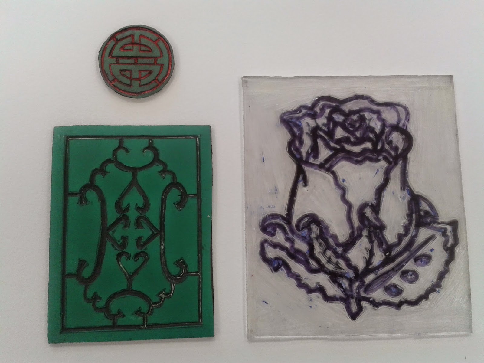
Three lino prints, two on a rubbery material, the last on a more plastic. When it comes to creating a good lino its about how steady the lines are and all the cut marks should be equal in depth. The actual prints made needed the paint to be smooth covered at the same consistency. Originally my idea for these prints was to engage them in the illustrations. As they didn't turn out as well I'd hoped I've decided not to involve them but the small red print seemed good enough to use in my ceramic tea set. The red and green prints are segments taken from background wall art in Chinese rooms, they still do have the style of the old photos and if there was more finesse I may have attempted an entire print of one the depicted scenes of the fairytale. The blue rose print is a central part of the story and all together I used the three prints to fill an entire sheet with. I wouldn't say that print making was a wasted effort despite all the problems, perhaps cutting work just needs more delicate attempts.


posted under , , | 0 Comments

Photo Negatives

The idea of using a phone in the dark room to project the light off the image and onto the shiny paper is a useful tip. It's difficult to navigate the image to fit on the paper and timing it right, typically the image needs to only be projected for 5 to 6 seconds and then you can have a decent photo negative. The first photo as shown here with twin dragon was originally just one drawing but I copied it onto some clear paper and flipped the clear one around. The two together had a geometric appearance with the scales and the shapes create an abstract effect. I then took a photo and used it in the dark room. Here the image developed fades slightly where the parts haven't been doubled over, making the middle area a central focus point. Another good thing about the negative photo is that the entwined dragons have lost their definition lines that made it easy to tell they were two different dragons. I defiantly think this was an improved result by transferring work to another art area.
The second photo was from a lino print I made, I zoomed in on the print with my phone and found once the image had been developed it was too simplistic. Placing some ink colours onto the photo with a slight runny effect made the photo more interesting to look at. 


Chinese Dragon

While trying different art styles of popular fantasy artists I decided to look back into my style I've used before and see if I could get any better outcomes. I found a small sketch I was working on which was this Chinese dragon to actually be better than everything else I've done so far, my style is more bold with the black lines and it simply looks better. Some of the artists I've researched that created patterns with details gave me an idea on what to work with, like the scales here are much like a pattern with how they repeat all over the body. This drawing isn't effectively tied with the story of the Blue Rose so I've sent it to go to Baileys with some other drawing I did after this one. It'll then be transferred onto a paper where the image can slide off and go onto my tea set making it all look more tied to the art concepts of China. From doing this I hope on trying ink drawing with my art style and seeing if I can continue to make it all more Chinese themed.


posted under , , | 0 Comments

Resin Casting Blue Roses

The steps taken for this process of resin casting was cutting a block of wood based on the size of what I wanted it to go around. Here the wood is cut for small ceramic roses similar to the larger one I've done before, the clay becomes less malleable the smaller it is and these roses are smaller than the palm of my hand so I thought resin would make them look better. The block of wood cut will need to be sanded well, especially around the edges as it could potently break the sheet when placed in the vacuum former. The block of wood should be slippery enough to wedge out of the mould and a screw inserted to pull it out without damaging the mould. After this point its about spraying the mould and making the resin mixture that gets poured in steadily. The resin should be poured in a vacuum degassing unit, as shown here with bubbles surfacing, it needed that done more because the resin is deep. 


Batik Technique

The technique of batik goes in the stages of making a design, lightly mapping it out on the fabric with pencil then waxing it. The wax is typically bought as small beads that get melted in the electric pan or pot. It takes time for the wax to melt but once it's at a liquid consistency the work can get started. There's different tools of use for making batik, a selection of them are called Tjantings, these have wooden handles and a small copper pot at the end where it can leak out the nozzle. Some end shapes will give better results than others like the triple end prongs for a more dynamic effect. The last tool for batik is the common paint brush, the finer the tool the better as the wax seeps through the fabric, making a larger wax line than originally planned. After all the light pencil lines have been covered leave to dry and get all the necessary fabric paints to colour. The last stages once dry is ironing out the wax with an iron. Newsprint needs to cover over and under as the wax will reattach itself to another surface instead of fabric and then the piece is completely finished.


posted under , , | 0 Comments

Walter Crane

Prince with Deer, from the Hind in the Wood, by Walter Crane, (1845-1915)

Walter Crane is viewed as one of the most well remembered artists of his generation with his book illustrations. In the earlier days even children’s books illustrations were considered high profile and seen as exhibited art to the public. Crane had the capabilities of doing detailed art as shown by his earlier work but later became inspired by how the Japanese art was portrayed more than his previous acrylic or oil paintings. The stylised pieces of art are considered to be his own in an almost trademark way. Despite being influenced by the Japanese art method, Crane has something Greek like about his art that especially flourishes when he does the older stories pertaining to this era. A lot of the time he managed to capture what the culture is like in his illustrations by researching instead of using imagination. While many artists could give a gritty approach to their retelling of the old fairy tales Walter Crane made it more cheery by simplifying the line art so the textures and colours would appear more prominent. The colours in his work were incredibly vivid when used on any surface, they all go together with enough contrast to stand out without making it out of place. Crane also did stained glass pieces along with trying other specialist areas. The stained glass and his illustrations go together as they’re connected with how he uses thick linear art and bright shades to create both. The stained glass process was done with thick lines and vivid colours as it’s the structure of the glass and the illustrations as it was his chosen method.
The art of Walter Crane is able to both simplify and stylise as he knows how to draw realistically well. I intend to try line art and possibly water colour to see if I can make potentially good results. The boldness of his line work is what I really hope to transfer to my work as this is how I hope all of my illustrations may look towards the end when they're final outcomes.

Arthur Rackham

Alice in Wonderland by Arthur Rackham - 10 - Off with her head!

Arthur Rackham has worked with various illustrations in books such as fairy tales ranging from Alice in Wonder, Peter Pan and Lord of the rings. His technique has an almost mighty appearance in regards to colour and tone. The colour scale uses mostly greys and light shades and assists in bringing out the linear work making the artwork seem rather dark and sketchy. The process he uses is unique to him and has been compared to photographic work. Rackham started the process by sketching out what he wanted then placing over the shapes and details, afterwards the process would be about adding ink line art. How much effort and attention to detail that he did shows how experimenting with techniques can make development work an art form. He even continued this experimental streak when he went on to make out cuts of figures and stories. Closely resembling shadow figures, this different style change happened after the war and it seems much more simplistic, perhaps he didn't wish to have the gritty style associated with his work any more. As he illustrated stories targeted for children and his old art may inspire negative emotions that isn't ideal after a war.

One thing that can be easily noted is how much detail and texture that gets placed into the illustrations overall; they’re all incredibly attention drawing, every section making its own detailed pattern, like articles of clothing or wood. This all together makes the art have less of an area of focus as many art pieces tend to do. After looking at this I would like to try and spend more time on my own drawings seeing what fits best and try giving each section its own pattern with attention to detail as Arthur Rackham has achieved in his art. 

Edmund Dulac


Paulina Drew Back the Curtain ~ from Tales from Shakespeare by Charles and Mary Lamb 1909

Edmund Dulac is considered an impressionable artist for his fairytale illustrations and produced most of his illustrations during the war. His illustrations were featured in books ranging from Jane Eyre to mythical stories and were used on his own designed stamps. His primary focus in all of his illustrations is people and possible settings he can create. Colour is often the mood maker as the colour palette is often dim in tone and gives off a sombre feel to all the work produced.
Edmund Dulac is a well known artist for mostly his fairytale drawings, but his type of drawing seemed drawn to a more mythical style from the very beginning and that’s why this work in particular is so remembered. The lines and the colour scheme is what makes Dulacs work stand out differently from the rest, despite going into near realism with the drawings, it still appears less so when the lines stand out and detail is focused on a patterned outcome. The colours in their dimness have a splotchy effect that makes the work more old in appearance that shows up with the scratched line making of the illustration. Edmund Dulac made work that has an old weathered theme that now places itself well with how old the fairytales are as they've been passed down from generations.

 I intend to use Edmund Dulac as a source of inspiration for my work with his pattern like themes and practice more on colour to try and get a better result with my own art work. His art has paid attention to the Asian folklore stories, which could help me find some understanding of how to make my illustrations have more cultural influences as his own has done. Another idea is how best the approach mark making techniques for the best outcome and the shading for each piece. 

Older Posts Home

Followers


Recent Comments